一.边框:border 设置对象边框的特性。
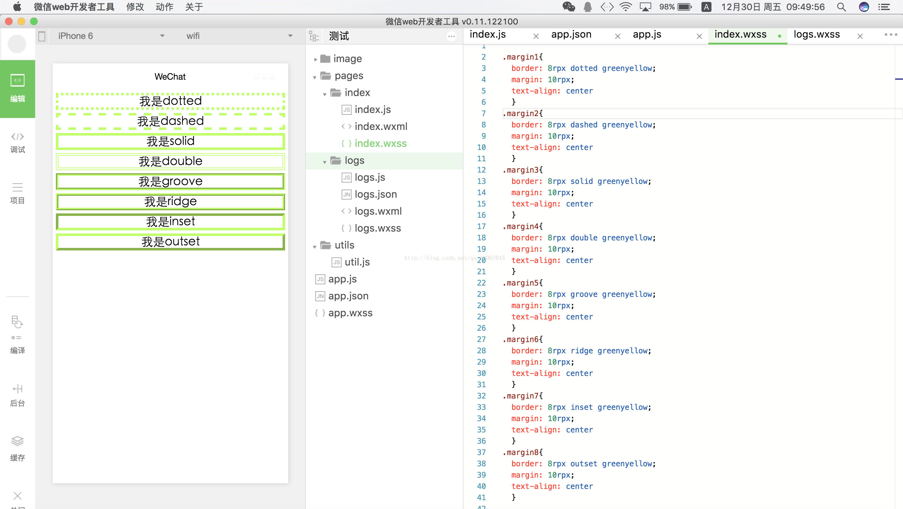
1.语法:border:length style color
2.style:none ,hidden,dotted,dashed,solid,double,groove,ridge,inset,outset。
二.相关属性。
1.border-width:设置边框宽度:常用取值:medium:默认值,相当于3px。thin:1px。thick:5px。不可以为负值。
2.border-color:设置边框颜色。
3.border-top:设置顶部边框。border-top-width,border-top-style,border-top-color 分别设置 宽度,样式以及颜色
4.border-right:设置右边框。
5.border-bottom:设置底边框。
6.border-left:设置左边框。
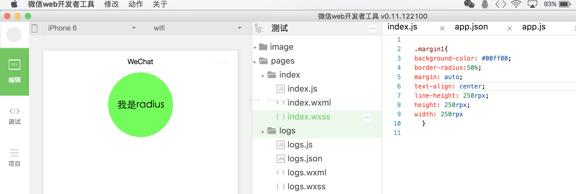
7.border-radius:设置对象使用圆角边框。取值为数字或者百分比。
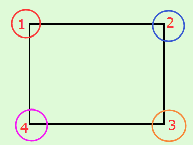
8.当然也可以给4个角单独的设置:
左上角:border-top-left-radius,右上角:border-top-right-radius,左下角:border-bottom-left-radius,右下角:border-bottom-right-radius
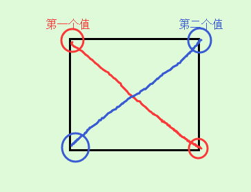
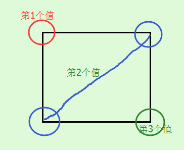
9.box-shadow:设置对象阴影。
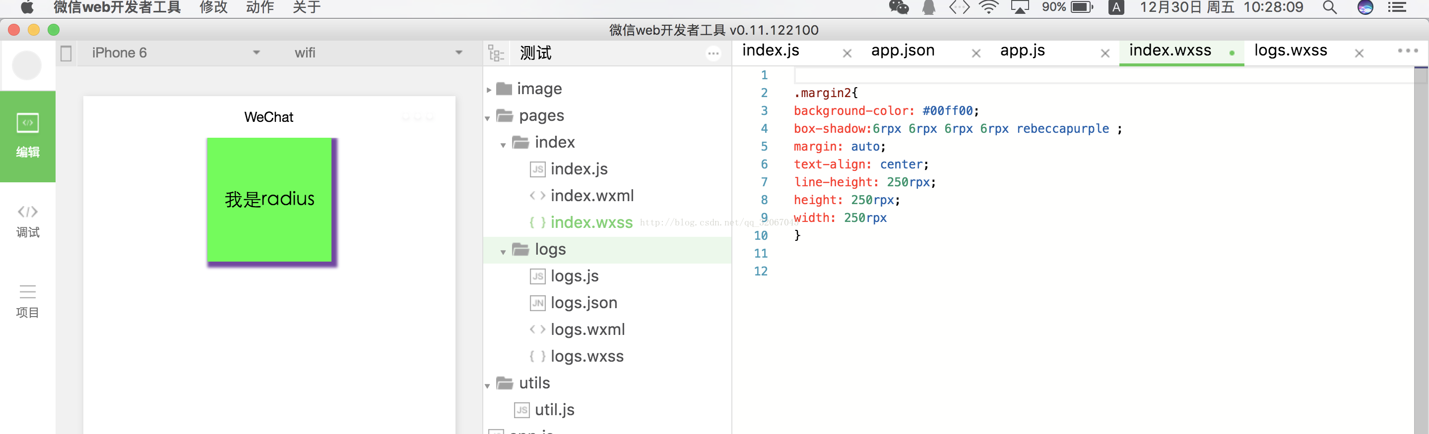
第一个值:设置水平方向阴影偏移量。
第二个值:设置垂直方向阴影偏移量。
第三个值:设置对象的阴影模糊值。不允许为负值
第四个值:设置对象的阴影外延值,不允许为负值
第五个值:color。
第六个值:inset,阴影在左上位置,如下图:box-shadow:6rpx 6rpx 6rpx 6rpx rebeccapurple inset

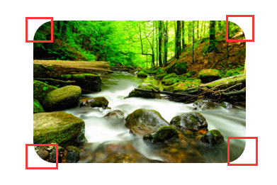
10.border-image:对象的边框样式使用图片来填充。
1>border-image-source:设置图片的来源。使用绝对或者相对地址或者渐变色来确定图片。
2>border-image-slice :设置边框背景图的分隔方式。取值:数值/百分比 fill.该属性指定从上右下左来分割图片,将图像分成4个角,4条边以及中间区域。中间区域始终是透明的,除非使用关键字fill。
3>border-image-width:设置边框背景的宽度。用于指定使用多厚的边框来承载呗裁剪后的图像。
4>border-image-outset:设置对象的边框背景图的扩展,意思就是说假如设置了10rpx,那么图像就会在原来基础上外延10rpx在显示。
5>border-image-repeat:设置对象的边框图片的平铺方式。
stretch:拉伸。
repeat:平铺,碰到边界的时候截断。
round:根据边框的尺寸动态调整图片的大小,使得刚好可以铺满整个边框。
space:根据边框的尺寸动态调整图片的之间的间距,使得刚好铺满整个边框。
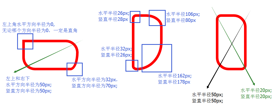
————————border-radius———————–
border-radius: none | length{1,4} [/ length{1,4}
其中每一个值可以为 数值或百分比的形式。
length/length 第一个lenght表示水平方向的半径,而第二个表示竖直方向的半径。
如果是一个值,那么 top-left、top-right、bottom-right、bottom-left 四个值相等。
如果是两个值,那么 top-left和bottom-right相等,为第一个值,top-right和bottom-left值相等,为第二个值。
如果是三个值,那么第一个值是设置top-left,而第二个值是 top-right 和 bottom-left 并且他们会相等,第三个值是设置 bottom-right。
如果是四个值,那么第一个值是设置 top-left, 而第二个值是 top-right 第三个值 bottom-right 第四个值是设置 bottom-left
除了上述的简写外,还可以和border一样,分别写四个角,如下:
border-top-left-radius: //左上角
border-top-right-radius: //右上角
border-bottom-right-radius: //右下角
border-bottom-left-radius: //左下角
分别是水平方向和竖直方向半径,第二值省略的情况下,水平方向和竖直方向的半径相等。
border-radius 只有在以下版本的浏览器:Firefox4.0+、Safari5.0+、Google Chrome 10.0+、Opera 10.5+、IE9+ 支持 border-radius 标准语法格式,对于老版的浏览器,border-radius 需要根据不同的浏览器内核添加不同的前缀,比说 Mozilla 内核需要加上“-moz”,而 Webkit 内核需要加上“-webkit”等,但是IE和Opera没有私有格式,因此为了最大程度的兼容浏览器,我们需要设置如下:
-webkit-border-radius: 10px 20px 30px;
-moz-border-radius: 10px 20px 30px;
border-radius: 10px 20px 30px;
请将标准形式写在浏览器私有形式之后。
举几个例子看一下效果:
效果:
四个角的半径都是30px;
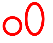
再看一个标准的圆以及椭圆:
效果:
第一个和第二个div的差别主要在于其是正方形还是长方形,圆圈在轮播时,可以替代圆圈的图片使用。
以上都是水平方向和竖直方向半径相等的例子,下面举两个水平方向和竖直方向半径不相同的例子:
效果如下所示: